Background
I participated in the international Dev Challenge competition as a product designer, Winning FIRST place. I worked on a mobile app for the charitable foundation “Come Back Alive”. The goal was to increase donations by making the app easy to use, improving transparency, and reaching a wider audience.
Come Back Alive is a foundation providing critical support to Ukraine’s Defense Forces. Since 2014, it has raised over $175 million, trained 10,000 specialists, and supplied essential equipment like drones, vehicles, and optics.
Core problem
Come Back Alive Foundation faces difficulties in maintaining constant communication with donors, which complicates the donation process and limits the attraction of new audiences, especially young people who prefer mobile platforms. The lack of a user-friendly tool reduces the transparency of the foundation's activities and negatively affects its credibility.
Currently, donations are made through banking systems or the foundation’s website. While reports are available online, they provide only generalized information, making it difficult for donors to track exactly how their contributions are used. Enhancing transparency and trust requires more detailed and accessible reporting.
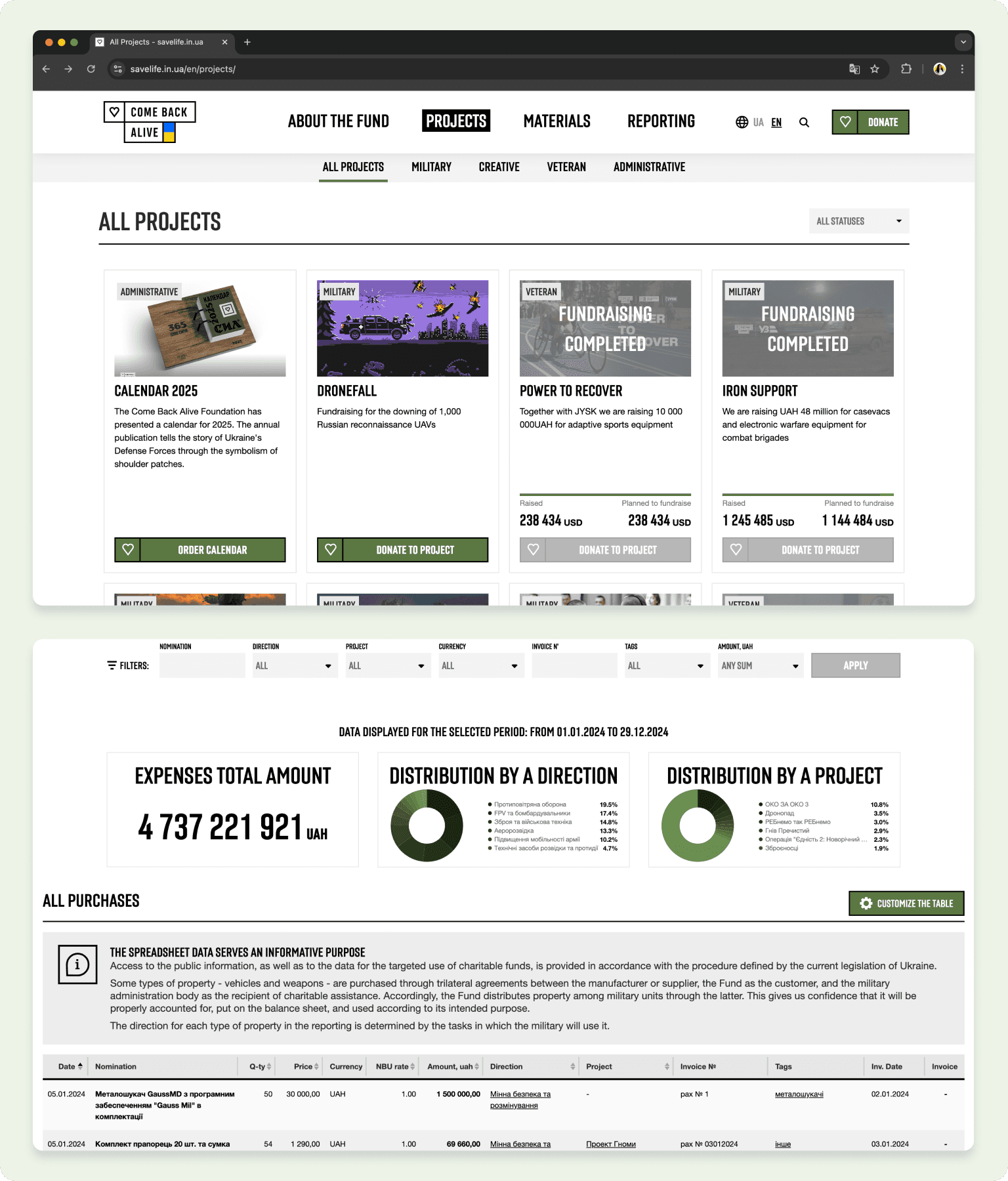
Current solution (Foundation platform with projects & reports)
Research
Initial Data Analysis
I focused on three key questions after analyzing the initial data and assessing the foundation’s challenges:
How can we showcase transparency for donors?
How can we motivate donors to contribute more frequently?
How can we attract new donors to support the foundation?
Competitive Analysis
I conducted a competitive analysis to identify patterns among competitors and gather insights to enhance user engagement. This research provided valuable benchmarks and informed our strategy for designing a more impactful solution.
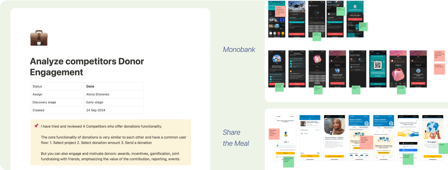
Left: Plan and of the competitive analysis; Right: Examples (Monobank, Share the Meal)
Recruiting and talking to respondents
Due to limited access to donors, I distributed a survey through social media to gather insights and connect with interested participants for further discussions. This approach resulted in 32 survey responses and the opportunity to conduct 5 interviews.
The insights revealed several key findings:
• Transparency and access to reports are key donation factors.
• Social media and mobile notifications are the main channels for information.
• Lack of information about fund usage causes difficulties for donors.
• Users often forget to make regular donations.
• Reward programs can increase donation frequency.
• Users want personalized reports on fund usage.
These findings provided valuable guidance for identifying design opportunities and crafting solutions to improve donor engagement and trust.
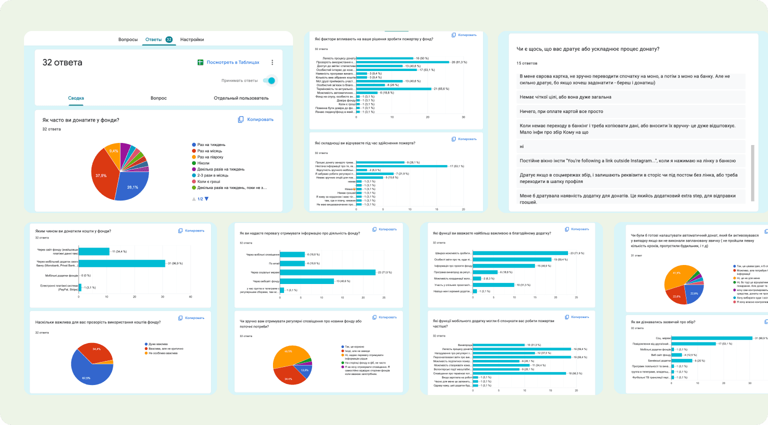
Snapshots of survey responses
Job Stories
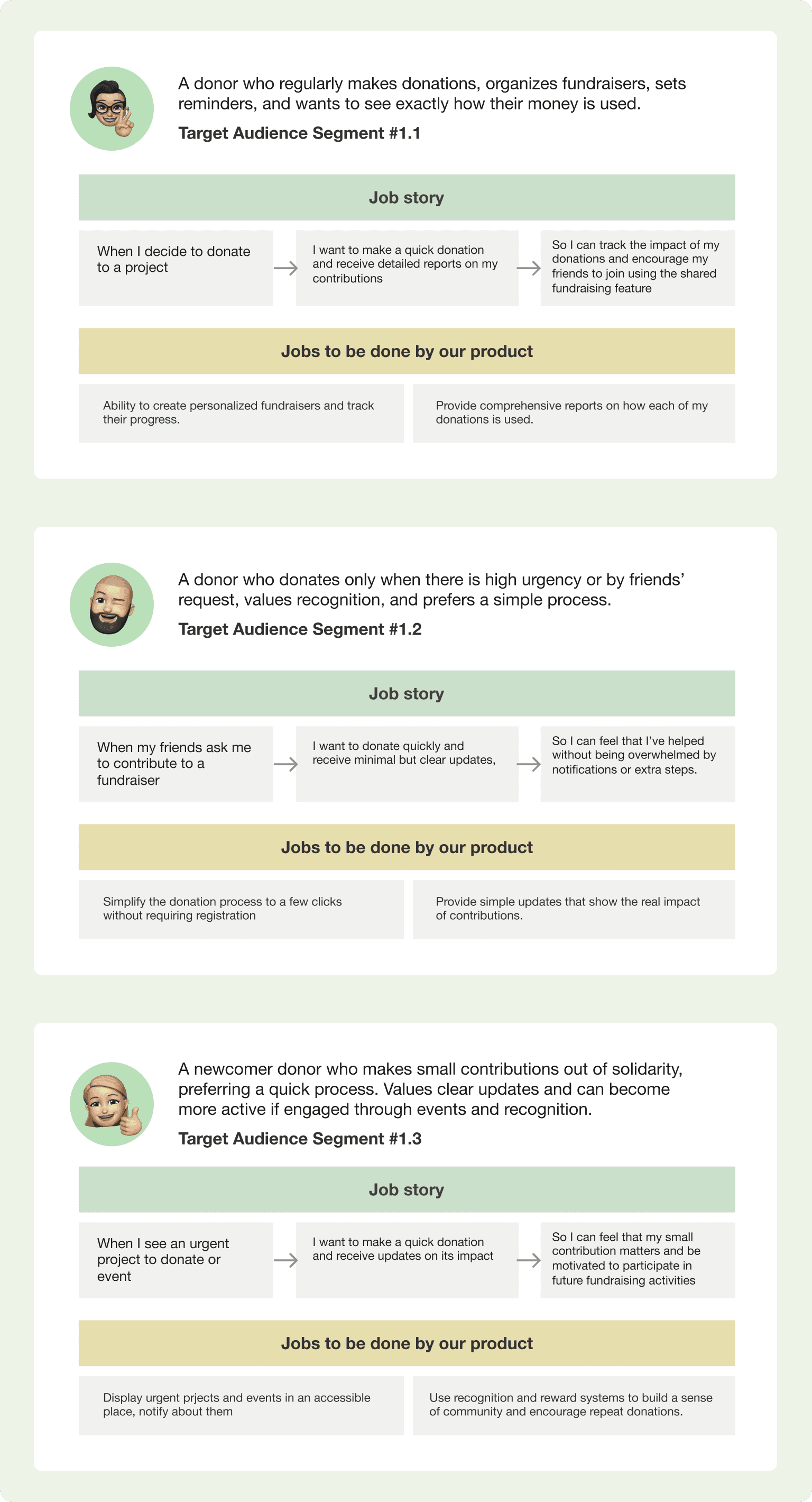
Snapshots of the user stories
Four forces diagram
The Four Forces Diagram was used to better understand the factors influencing donor behavior, both in terms of their current habits and their willingness to adopt a new solution. This analysis helped uncover key motivations and barriers that affect how donors engage with charitable foundations.
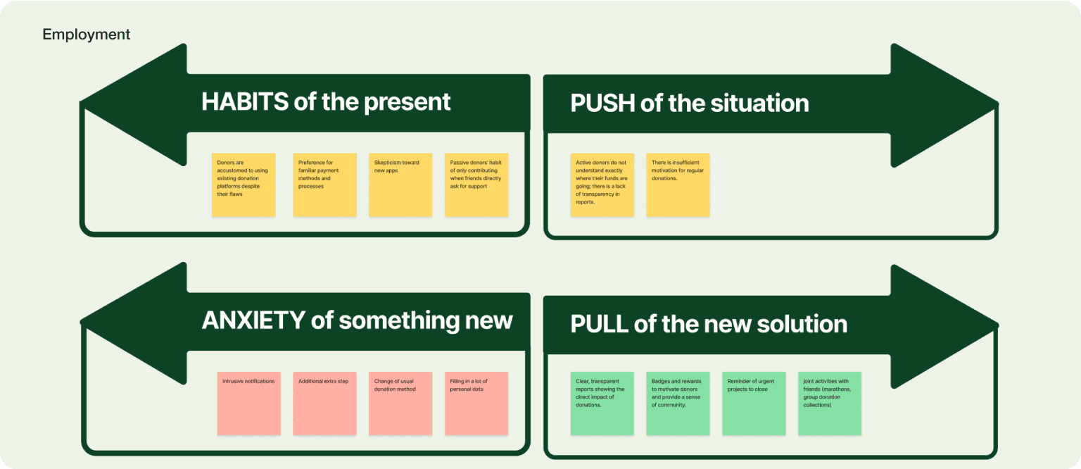
Four fources diagram in Figjam
Solution
Quick Donation
The goal of the “Quick Donation” core feature is to simplify the donation process, making it fast and accessible directly from the main screen. This encourages more frequent donations by reducing barriers and providing instant rewards for contributions.
Donations can be made directly from the main screen featuring urgent fundraisers and news.
Each fundraiser has its own detailed page for more information.
One-click donation: Simply enter the amount (with an option for monthly donations) and confirm the payment.
Default payment method is Apple Pay, pre-set for immediate use.
Users receive an instant reward after their first donation.
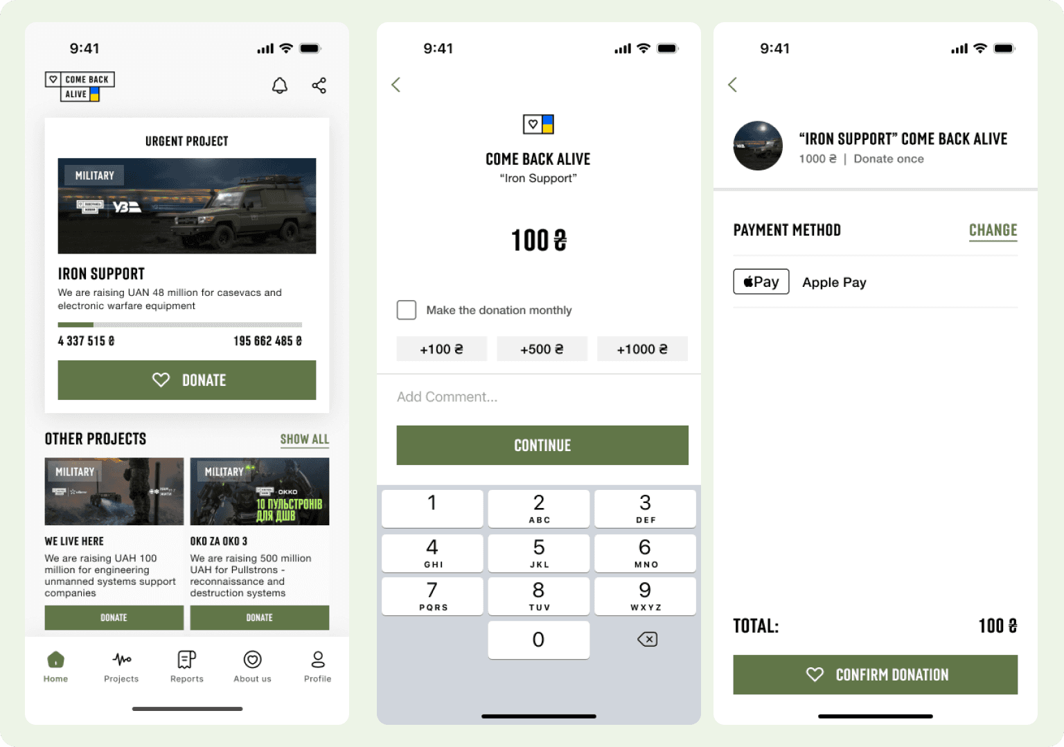
Solution for Core feauture Quick Donation
Reports
The personal reports feature allows users to track their donations and see how they are being utilized. Users can view statistics, download reports, and get detailed insights into their contributions.
A list of completed donations with detailed reports and the user’s personal contribution
A dedicated report page with the option to download a comprehensive report file
Detailed filtering and search by specific time periods, hashtags, and project names
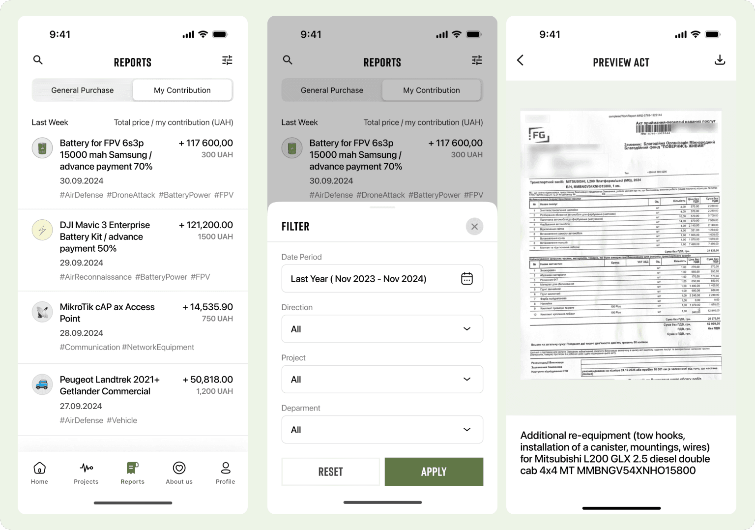
Solution for feauture Reports
Friendly jars
The “Friendly Jars” feature enables users to create and share donation campaigns with friends and family. Users can set a fundraising goal for their jar (optional), choose a cause to support, activate a donation link, and share it on social media or directly with friends. They can also track the progress of the fundraising campaign to stay motivated.
Choose a project to support
Activate a donation link
Share the link on social media or with friends
Track the progress of the fundraising campaign
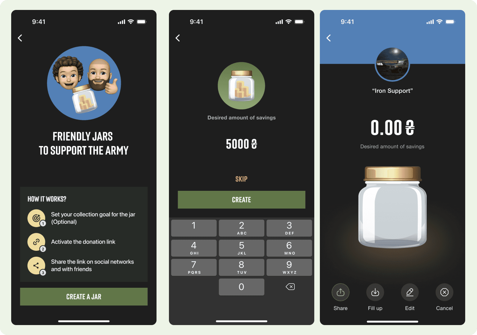
Solution for feauture Friendly jars
Uniting events, marathon
The goal of this feature is to engage users in fun and meaningful activities that encourage donations. By participating in health-related events like marathons, users can link their health app, track their steps, and donate as they achieve milestones. This creates a sense of community, promotes fitness, and motivates users to contribute to a cause.
Participate in the marathon event
Connect with a health app for step tracking
Make donations linked to activity goals
Track steps (e.g., reach 10k steps, make a donation, earn rewards)
Share achievements with friends to inspire more participation
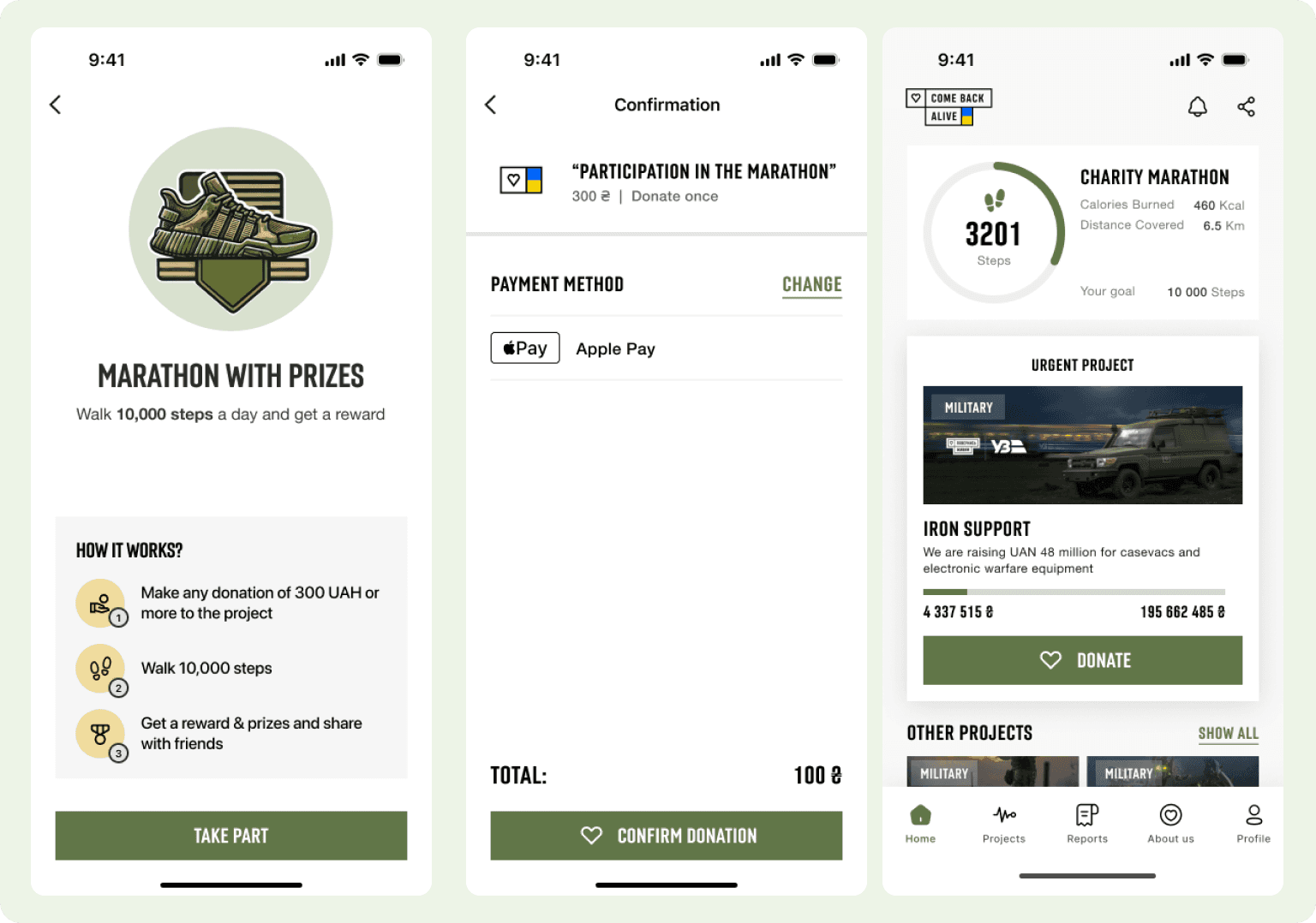
Solution for feauture marathon
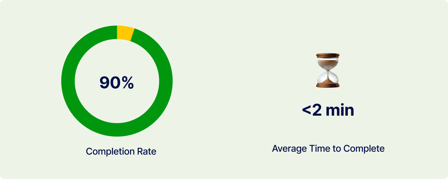
Usability Testing
To test usability, I created a prototype, testing script, and scenarios to conduct an moderated usability test with ten internal team members who were unfamiliar with the project. I also conducted two moderated usability testing calls with our current users togather feedback on how they interacted with the product and to identify any issues.
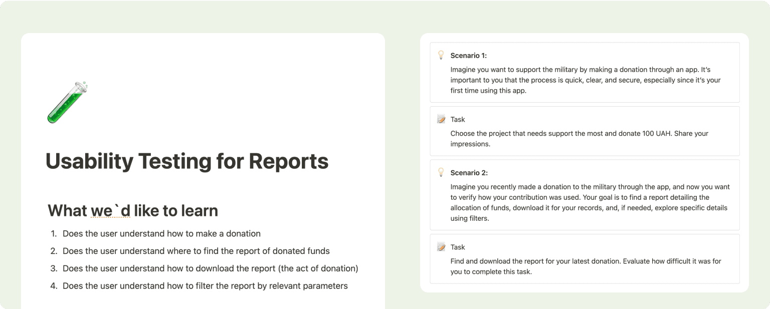
Left: Plan for the usability test; Right: Tasks and scenarios for the usability test
Insights:
Users struggled to locate and access the preview of key documents.
The download functionality was not intuitive or easily discoverable.
Users expressed frustration over the absence of contextual details explaining the purpose of the document.
There were frequent requests for a summary section with general data to provide a clearer understanding of donation activity.
UX Improvements
Through usability testing, I discovered several pain points in the reporting functionality. Users struggled to find document details, download reports, select specific time periods, and view an overview of their donation data. To tackle these issues, I introduced design improvements to make the reports more transparent, accessible, and user-friendly.
Adding Overview and Document Link
I added a summary with key data, like the reporting period, and included a link to preview the confirmation document This helped with:
Quick Insights: Users gain instant access to key metrics and changes without unnecessary effort.
Clear Reporting Period: Eliminates confusion by clearly indicating the time frame of the data, reducing extra steps.
Improved Navigation: A direct link to the confirmation preview ensures faster and more seamless access.
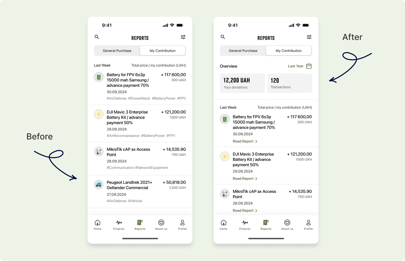
Left: mockups before; Right: mockups after
Improved File Access
During testing, users struggled to quickly understand how to download the document and found the lack of additional details about the act confusing. To address this, I made the download action more visible, and added an info icon providing supplementary information about the document. These improvements addressed key usability issues and delivered the following benefits:
Improved Visibility: A larger, more noticeable download button ensures users can easily locate and perform the action.
Additional Clarity: The info icon helps users understand the purpose and details of the document before downloading.
Reduced Friction: Simplifies the process, minimizing confusion and unnecessary steps for users.
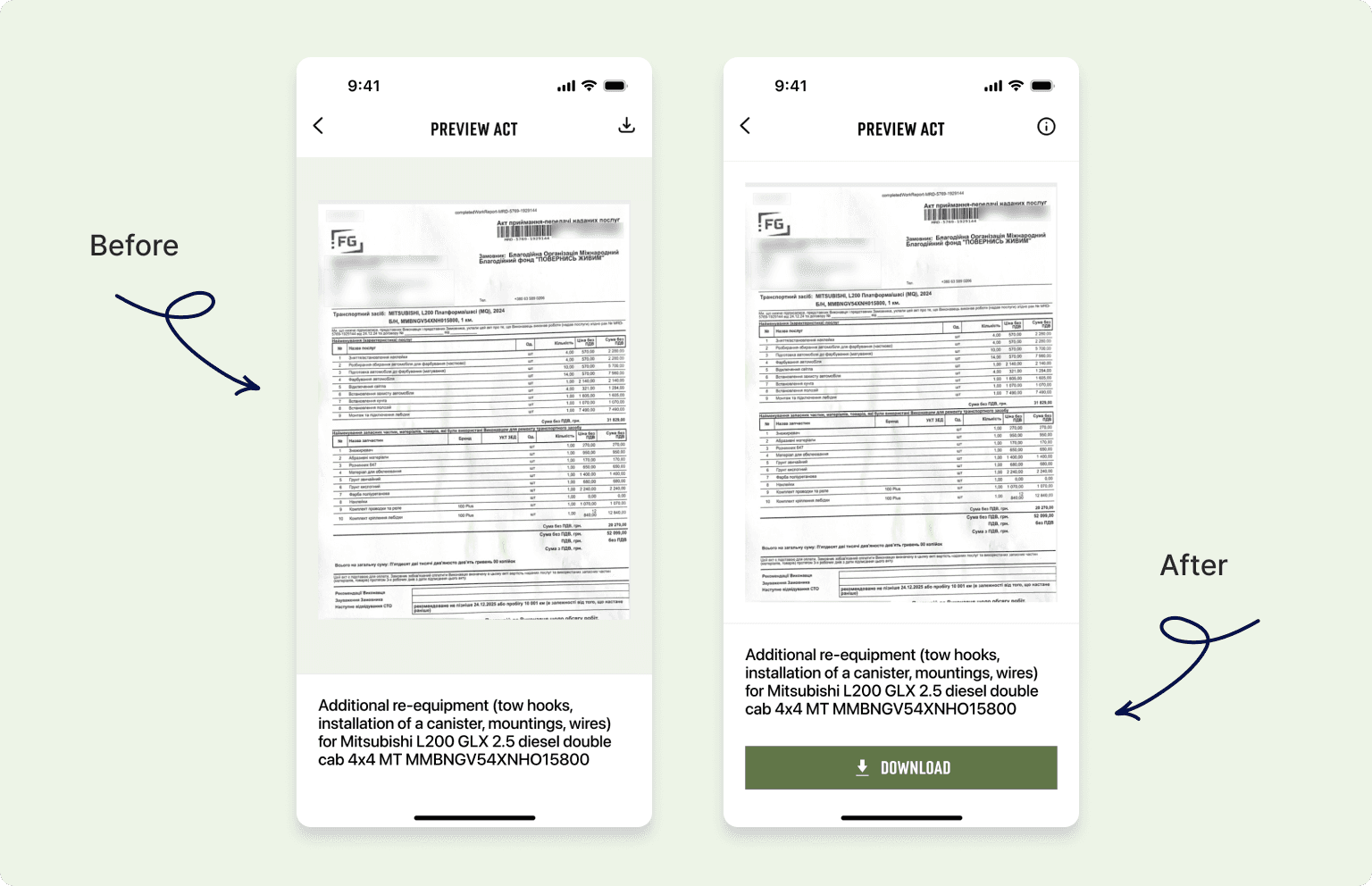
Left: mockups before; Right: mockups after
Further Steps
As this competition project earned first place, the foundations laid here will inform future development. The following steps are key to creating a fully functional and user-friendly application:
Design a seamless onboarding and registration flow to improve user adoption.
Develop “About Us” and “Profile” sections to foster transparency and personalization
Refine tooltips and address corner cases to enhance usability across diverse scenarios.
Implement a robust notification center and push notification system to keep users engaged and informed.
Prepare comprehensive developer documentation to ensure efficient and accurate implementation.
Configure triggers in Amplitude to measure key metrics and analyze the impact of future updates.
Conclusion
My work on the competition project for the donation platform allowed me to apply my product design expertise to address key user challenges, resulting in solutions that enhance transparency, usability, and engagement. While I was unable to continue working on the project beyond the competition, I am confident that my contributions have laid a strong foundation for future development and identified critical areas for improvement.